

An Art Recipe
By Finnabair
I’m a woman of many interests: a mixed media artist, scrapbooker and art journaler who loves new challenges, experiments and developing new techniques and skills. My projects are mostly media-based: I make paper and canvas layouts, collages and altered art, tags, journal pages. I started scrapbooking, and today I’ve got a scrapbook page named roughly “One-of-a-Kind”:
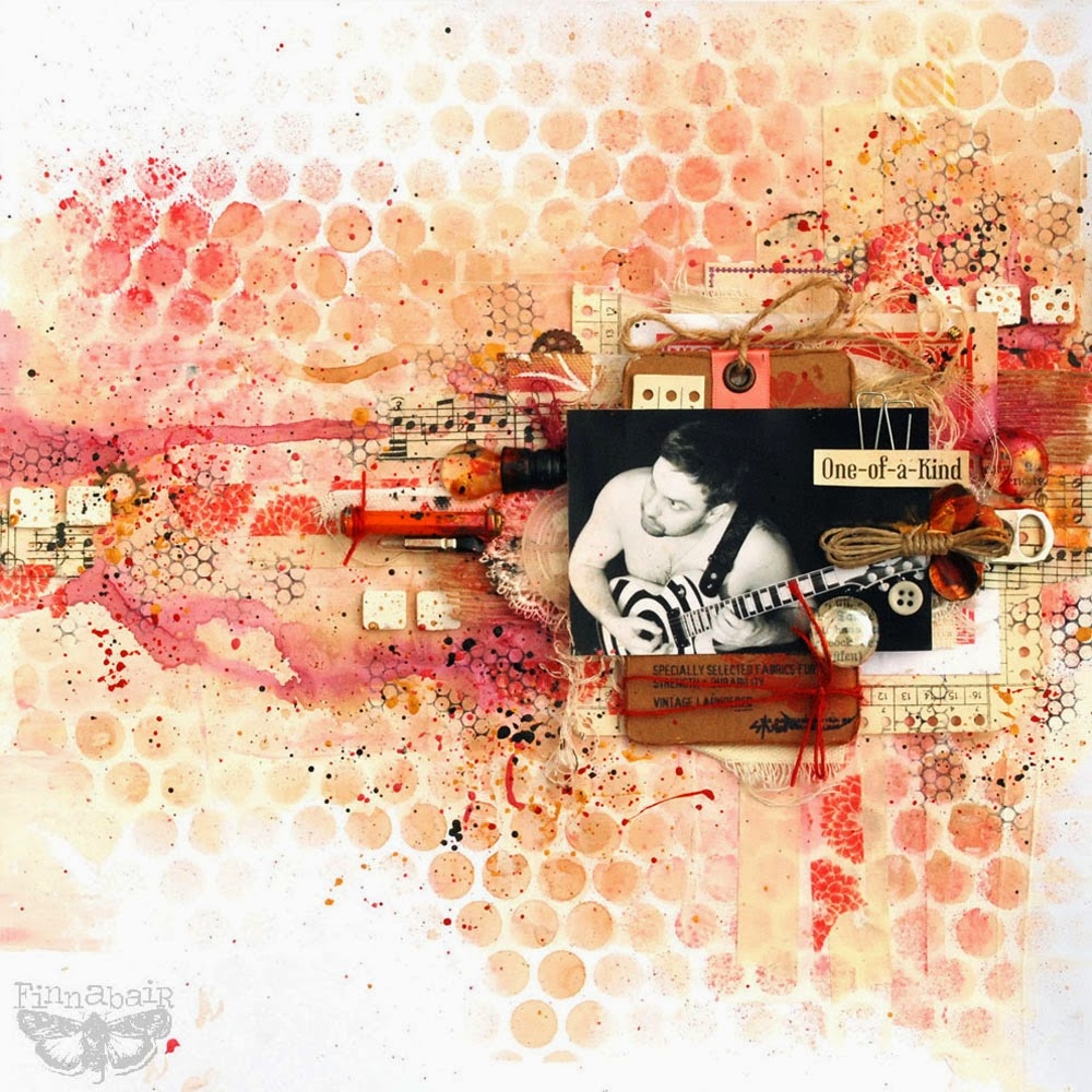
The source of the inspiration, a secret thing hidden deep in all the layers, is an old broken string from my husband’s favorite toy, his electric guitar. As he knows that he’s not allowed to throw away anything made of metal without my permission, he passed it to me together with the packaging from the new one…and this is how the story started!
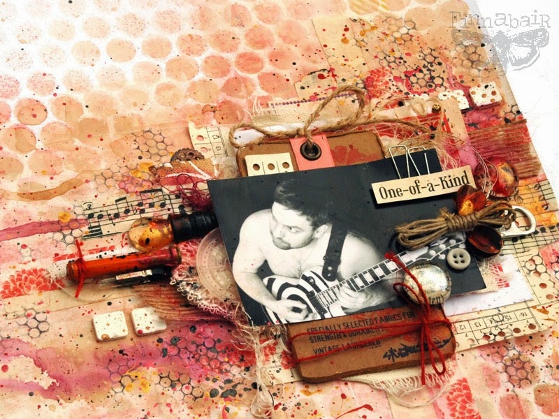
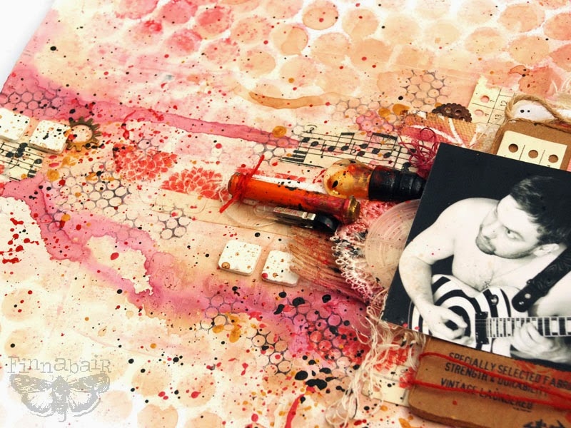
If you will take a closer look, you will find both the string and the white and red packaging. But this is not all. Besides typical Prima embellishments such as beautiful trim, some washi tape, Mechanicals – Roses or Light Bulbs (junkyard findings), I was able to fit in some other elements, these from radio, instant coffee leftovers, a can opener, pieces of string in three colors, and a store tag.
Can you also see 3D Foam Squares? I guess using them as embellishments is my new addiction. Oh well.
I have to admit–using findings, little bits from my “rubbish boxes” together with paints and some pretty “branded” pieces, is my favorite way of creating. I can’t resist the beauty of rusted metal, histories hidden within piles of old buttons or old book pages….
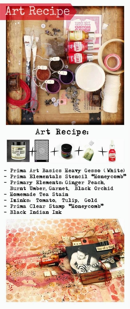
The colors were totally inspired by the palette of the string packaging and kraft tag: although reds, pinks and browns are not typically “masculine” colors, I think I managed well. The final effect is a marriage of Art Basics Heavy White Gesso, tea stain, Primary Elements mixed with water, and some Izinks in shades of Gold, Pink (!) and Red. There were some black final touches added of course; some stamping and some splashes of Indian Ink, but in general, the page is in nice warm tones.
Ok, time for more details:
Here is the list of the supplies I used to create this page, and a step-by-step:
1. I started the project on a plain white page, applying a couple of layers of Art Basics Heavy Gesso, mostly around the place I’d planned my composition. The gesso added a bit of texture and more warmth to the white color. As gesso is a primer, it ia slightly resistant to water-based sprays; the sprayed areas covered with gesso will be lighter than on the naked white paper.
2. When the gesso had dried, I used a Prima Elementals Honeycomb Stencil (12×12” size) and sprayed Tea Stain and Primary Elements mixed with water to achieve a nice red and brown background pattern. After it had dried, I began layering the place where I wanted to use the photo. I used some masking tape for nice warm, semi transparent texture and two kinds of Washi Tape: TH Tissue Tape with Music Notes and Washi with pretty abstract red flowers.
3. With craft glue and staples, the next step was to build up the layers beneath the photo with old papers I had in my collection, together with the string packaging, kraft tag, random pieces of ripped canvas, a bit of white and kraft trim. I then mounted it all onto the background with 3D Foam Squares (Scrapbook Adhesives by 3L) – some of them I also used as embellishments on the page!
4. Finally it was time for embellishing: I added all kinds of the bits add bobs from my table, including pieces of colorful strings (one styled in a nice looking bundle), metal guitar string, pebbles with vintage texts, metal rose, light bulb, tin opener, pieces from an old radio… just name it! Again, I used my craft glue and also a smaller version of 3D Foam Squares.
5. When everything was put together, I added more color. I carefully sprayed a bit of Garnet and Black Orchid Primary Elements with water in the middle of the project (covering the photo with paper towel) and made it run a bit, adding a hint of Tea Stain. When the project was dry, I added a bit of stamping around my composition for the extra contrast–Prima Vintage Vanity Honeycomb Stamp together with Jet Black Archival Ink.
6. Finally I added some more color using Izinks (acrylic pigment inks). I applied them on my pebbles, metal embellishments and watered them a bit with a water mister, if needed. To finish I put my paintbrush into them and added some colorful splashes. I repeated the same step with Black Indian Ink – for extra contrast. Voila! For more on these products visit my website at http://tworzysko.blogspot.ie.
However you created this piece, the end result is beautiful, evocative. I love the history of old buttons and a lone glove buried in a drawer, notes scribbled on the sides of pages in an old book…you’ve given me inspiration. Thank you
wonderful how resourceful she is at finding resources; just about anything can be recycled.
This is so beautiful n very interesting, Sandra.. Love the cover page 🙂
Yes Rat, the layering is so interesting…good to hear from you:)
Thank you so much for your kind words and interest, ladies!
You are a delight to have Anna!