
Composition Ideas to Make Your Art Stronger
By Melinda Tidwell
See her work in Vol. IV #2
Part 2 of 2 on Collage and Visual Weight
In the last post [part 1] I mentioned that when we explore unity vs. variety, it kind of leads us to looking at something called visual hierarchy. As I thought about it, maybe we should talk first about visual weight. The elements of your composition can be said to have different visual weights; that is, the heavier an element, the more the eye is drawn there, the lighter the element, the more it is in the background.
Qualities that make elements heavy can be: high contrast, sharp edges, big/vibrant color, darker color, unusual/intricate shape, pattern.
Qualities that make element light are like: low contrast, soft edges, smaller/less distinctive shapes, muted colors, lighter colors, flat color.
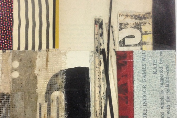
One of the most fun parts of composition is balancing visual weight and activating the entire space of the picture. Lets look at one of my pieces, since I actually know how it came together.
I began with a black and white design with a weird shape, some bold type, and some skewed black lines in the middle. There is some unity because of the color scheme. The two pieces of text sort of connect from similarity in size, shape, color. The lower left corner is very heavy, with all the black, and the high contrast type. The lower right is less heavy. The middle bars of black, overlapping, is my favorite part. I like the balance of shapes and slants. The two upper corners feel bare without any reason. Sometimes negative space is balancing positive space and it completely works. But not here.
I did not take a bunch of shots in between, unfortunately, so please try to visualize this progression.
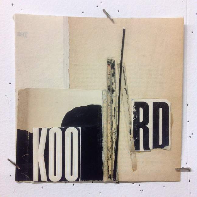
The first thing I wanted to do was get something in the upper half of the frame. Stripes make me happy so I pasted a patch of wobbly, hand-painted black stripes. That got the piece moving. Then I decided the text was just too problematic, so I covered the “RD” with a piece of sanded book cover. The “KOO” was then way too bold, but I liked those shapes, so I obscured it mostly with some cloth.
In the upper right corner I found a piece of black that could wrap around the corner (a nice relief from all the vertical rectangles) and I cut its inside corner to be rounded, and uneven. The curve connects, visually, to the black shape in the lower left, creating more unity. The wobbliness of the cut contrasts the perfect straight lines and gives us more variety, thus energy.
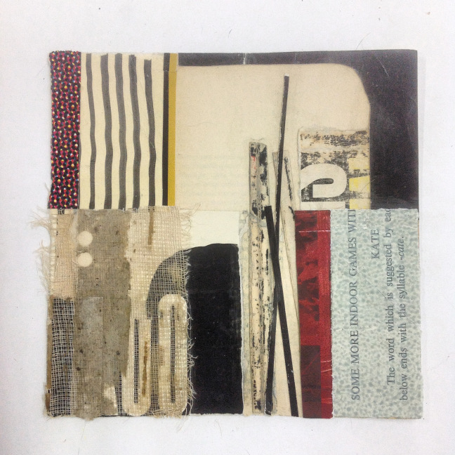
So now the black is moving around the whole picture and making connections. But the picture still felt like it could have more life, so I looked at adding color. The light aqua blue made that corner much more interesting than just the sanded book cover (most of which I covered, sorry I don’t have a picture to show you how dull it was!). There was also some dark red on my table that offset and energized the aqua even more. Paste it down!
My upper left corner was still a little weak so I repeated the red shape, in a different material. And now I was mostly done. I had a nice balance of darks and lights distributed over the picture, but not too evenly. A balance of materials, the odd shape here and there. But I kept noticing that hint of yellow in the sanded book cover and wanted just a bit more of it. The gold and black stripe arrived as a fun afterthought.
Notice that keyword “fun.” Keeping this work fun is a great goal. And as we are looking at design principles I want to caution everyone, myself especially, to not get overly uptight about them. They are guidelines, and I think really helpful, but if they are all you have, your work feels empty and stuck. Use materials that are fun for you, colors you like, shapes and textures that give you a little buzz. The playful energy that you communicate in your work is really valuable to your audience. As adults, I at least, really want to return to the sense of abandon and naturalness we had as kids. A little adult design principles and a lot of childish playfulness is a good balance to aim for.
Please leave a comment below if you have any questions or thoughts about visual weight in your own work. It’s great to hear from you.
Happy Creating,
—Melinda
Originally posted by Melinda Tidwell on Melinda Tidwell Blog
Hi Melinda, I really liked your text, it is true that the part of the tensions and visual weights is funny, a game, as you say, very good to read, thank you!