
Composition Ideas To Make Your Art Stronger
By Melinda Tidwell
See her work in Vol. IV #2
Part 1 of 2 on Collage and Composition.
Collage is a great medium for artists who want to explore the wonderful world of abstract composition. Since you can try a lot of visual ideas without committing, it can really free up your imagination and sense of play. And there is so much diversity in the materials that you can use. Really, artists use almost anything; but in book collage it can be titles, text, images, diagrams, blocks of color, shapes, fabric, stitching. It’s exciting. But it can also be overwhelming. Found materials, especially old materials, have a lot of built-in personality and character. They can tend to fight each other on the page. In art fundamentals, they talk about balancing variety and unity. I find it a really useful framework for looking at your work.
So variety, difference, diversity—these create energy in your work. The eye leaps among very different colors, shapes, sizes, materials, and we get this charge. But we also very naturally want to pull it together into some kind of order. We don’t want chaos. We want to see connectedness.
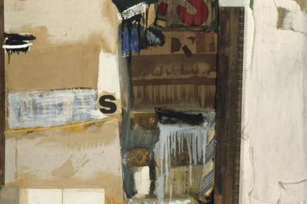
Robert Rauschenberg’s work is an ideal place to study the balancing of these opposing forces. He was a great lover of unusual materials and is a master of wildly diverse compositions.
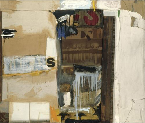
How does Rauschenberg get to this feeling of wildness yet unity in the above piece? First, there is a sense of structure, a grid perhaps, that underlies the image. A recognizable structure, even if only loosely followed, helps to create unity. Rauschenberg often works in thirds, dividing the canvas into three rows or columns. It’s a structure I particularly like.
Second, he has quiet spaces where the eye can rest. Areas of strong diversity/activity are balanced by calm, neutral areas where there is less going on. I would also say it’s part of unifying to simplify your compositions. That third column could very well have been a ton more collage elements that he wisely decided to just paint over.
Third, he uses similarity. Very different elements can be brought into relationship by making them more similar. The middle column of this painting is packed with differences: photographs, a tie, the letter S, some black stars, a plank of wood— these are all brought together through values of brown. Similarities of hue and value are strong ways to unify. The eye builds an association almost immediately. Also shape. Similarity of shape between the reflection of the city skyline and the light bluish paint drips creates a bridge between these two elements. The drips extending to the bottom of the canvas, brings in the tie (similar hue, proximity) and the stars (overlap, proximity).
Fourth, notice the use of repetition. If there were only the one black “S”, it would not bind as well to the painting. But then we notice a second, red “S”, different but similar, which establishes a well-connected relative (so to speak). The repetition of blocks of white create a spatial connection between isolated areas of the painting. Your eye can travel white to white to white and encircle the canvas. I really do start to think of these elements as people at a raucous garden party with many subterranean connections—maybe I have been watching too much Downton Abbey. But a lot of the fun of that show is how different and well-drawn the characters are. Variety makes things interesting, and exciting.
I want to note something I just love in this painting: the two white squares in the lower left corner. They are sepia toned photographs of mostly sky. Being perfect squares they have a severity and stability that is a delicious contrast to all the more organic shapes. They reinforce the strong, straight boundary between columns two and three and give the painting a nice sense of strength. So subtle and so FUN!
Next post, I want to discuss another aspect of visual unity that this picture has in spades: a masterful sense of hierarchy. This is one of the most important elements of design, that is, to have different levels of dominance in your composition. If everything is loud, you just get noise. Adjusting the volume of your elements begins to give your composition an overall shape, and harmony.
Meanwhile, how do you handle variety and unity in your own work? Do you use a structure? Do you prefer more unity or more variety, and why? Leave a comment below (and lets see if I actually have that working!).
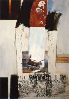
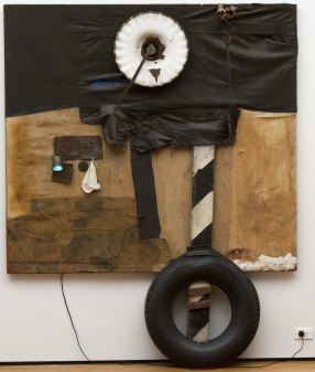
Here are a few more Rauschenbergs to enjoy until we meet again…
Happy Art making,
—Melinda
Originally posted by Melinda Tidwell on Melinda Tidwell Blog.