
Painting to Make Sense of Pain
By Richard Malinsky, Arts Editor
Submit your website for review by WTP
On his website, David French’s artist statement begins poignantly: “I was diagnosed with cancer in 2000. Today I am cancer free. This personally painful experience profoundly shaped me as an individual and artist. This event informs my artwork today. I do not try to represent those moments I had. I find myself creating imagery in order to make sense of certain things that have occurred or I wish to occur.”
For French, it is the process of painting itself that seems to touch, nourish, and heal his artistic soul. He equates the physical organic quality of oil paint—its fleshy, visceral consistency—to the body, and the painting surface to skin.
The site is organized into six major series of paintings. In Nights Liquid, the first series, French employs metallic pigments to symbolize Cisplatin, a platinum-based drug he received in his chemotherapy. He explores the paradox of this drug, at once a toxic metallic poison and a giver of life. In “Between Two Cities,” massive black forms ominously descending downward are surrounding by a small area of bright color–perhaps a symbol of hope:

In his successive series on the site, Monochromes, Union, and Triads, French explores the relationship of the subjective artist to the essential elements of painting—the paint on the surface proves as important as the artist’s guiding hand. There is an uncluttered freedom and celebratory statement in “Untitled”:

In the Union Series, a secondary color is blended to create tertiary colors and to a visually rhythmic effect. The motion in “La Rue Montorgueil (after Monet)” was achieved with a squeegee-like applicator:

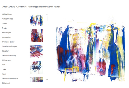
Triads is perhaps the most textured of his series, with the application of thicker paint and greater blending techniques, as in “Better With You”:

And as to range of color, this series is also the most varied. Overall, primary color predominates, a quite purposeful and for French, quite meaningful, choice: “The essential painter’s toolbox consists of the flat surface, red, yellow, blue and white. I think of my interaction with these basic materials as a collaborator. I equate my action to those tool box components, everything contributes proportionally. The pallet is skipped in these works, in an effort to work more directly with the essential materials. By working in a manner where I do not represent something, I touch on the very essences of painting.”
While painting appears to be his primary medium, on his site he also includes a quite impressive portfolio of outdoor sculptures.

Overall, his website presents a triumph over adversity and the celebration of a new beginning.
Copyright 2017 Woven Tale Press LLC. All Rights Reserved.