
A New Perspective on Framed Art
By Amy Nawrocki, WTP Guest Writer
 As an art lover, I like when I’m challenged to see something new. I like to think of myself as open-minded and open-eyed. But sometimes even the most enthusiastic viewer—never mind how knowledgeable she is—has to admit that the element she missed was right there the whole time. Sometimes it doesn’t take much to reframe our perspective about what we’re seeing and what we’re not seeing. I had the opportunity to do so recently when I encountered the work of Maurice and Charles Prendergast.
Audiences familiar with American art will recognize the name Maurice Prendergast. I did too, and that was enough to bring me to the New Britain Museum of American Art for the exhibit devoted to the brothers’ work as “American Post-Impressionists.” Charles, however, was unfamiliar to me and I was curious to learn how he fit into the landscape of one of my favorite art movements. What I found changed my impression of the museum experience.
Like other artists of the late nineteenth and early twentieth centuries, Maurice (1859–1924) found inspiration and artistic success abroad and used these influences as he painted scenes depicting his northeastern upbringing. Charles (1863–1948) also traveled abroad but found work closer to home, employed in a Boston firm as a maker of decorative wooden moldings, eventually becoming a prominent frame maker as well as an artist in his own right.
As a framer, Charles’s aim was “to bring out the fine points of a good picture.” This could help explain why Charles isn’t better known: he’s in the background, or rather, he is the background. Just as one’s biography can shape our understanding of his art, understanding what physically surrounds a painting has a profound effect on seeing the painting that’s held within. A good frame can change the way we think of a painting, and we shouldn’t dismiss it as simply extra, optional, or decorative. When we pay attention, we see the craft, deliberation, and value of both the painting and its frame. Seeing Charles’s frames, especially around his brother’s paintings, put this idea squarely in my mind.
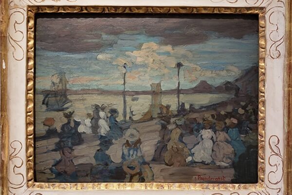
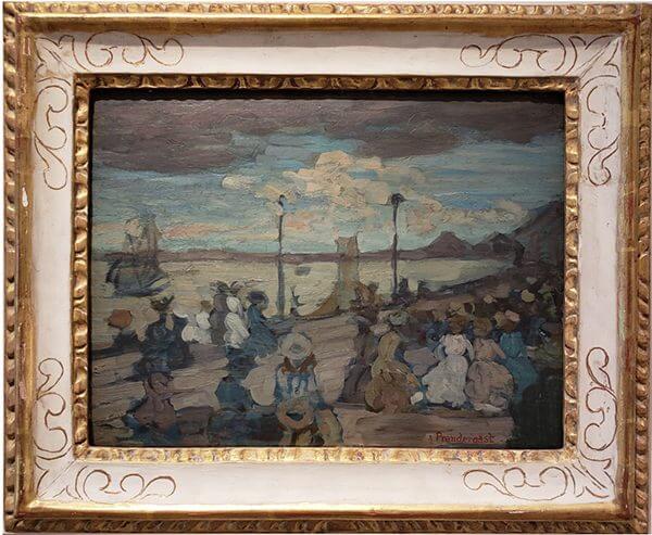
Without knowing how the frame and painting came together—if Maurice solicited a certain pattern or if Charles built his frame to match or even contrast his brother’s image—I nevertheless found the effects intriguing. For example, in “Approaching Storm,” the wood of the frame and the wood of the panel speak to each other. The frame’s molding is loosely carved, painted in gold with a white inner block decorated with hand-drawn gold designs. A modified fleur-de-lis fits each corner, and rounded, oblong free-form designs repeat part way down the inset molding. In frames like this one, Charles’s association with the Arts and Crafts movement is easily seen. The frame has a homemade feel to it, but his imprecise technique matches the roughness of Maurice’s brushstrokes. On the other hand, the simplicity of Charles’s design contrasts the thick and deliberate slate storm clouds at the top of the painting. Charles’s rounded curlicues contrast Maurice’s parallel pier planks, just as the frame’s white links the white dresses of onlookers.
Charles’s most successful frames are those which pull back from obvious adornment. In another pairing, decoration comes through with the impression of petals and blossoms tendrilling along the edges of Maurice’s painting “North Shore.” This frame has detached slightly at the nailed corners on the diagonal. Charles’s floral design seems misplaced around Maurice’s pier scene, but interestingly, those contrasting images reinforce the effect of a broken diagonal bisecting the horizontal wave and pier lines. It is these surprising (and probably accidental) contrasts which are most interesting.
With “Sunset, Boston Harbor,” Charles’s frame has gilded corners and distressed red paint which picks up the pinks and blues of Maurice’s painting. A pink grapefruit sun and an improvised totem pole off to the right nearly match the frame’s color. This is perhaps the most obvious partnership between frame and painting. In other examples, the knobby carvings around the frame undercut a gilded look and sometimes look sloppy and predictable. But at least I am paying attention.
Charles’s work as a frame maker provides an interesting corollary to his work as a painter, and for me as a first-time viewer, a way to contextualize his paintings. I began to pay attention to his craftsmanship and use of varied materials. Also, I began to reconfigure my understanding about the trajectory of American art. Maurice’s paintings push forward from Impressionism and Post-Impressionism to Modernism and even Abstract Expressionism, while Charles’s flatter planes and Persian and Egyptian influences gaze back at the ancient and the mythic.
Something else began to happen as I continued to look. With Maurice’s Post-Impressionist style, he alludes to human form by outlining his characters, usually in black, just as a horizon line or building’s walls are emphasized this way. He’s framing the figures, in fact. Such a technique sets the figures visually apart from each other—one could count the blank faces on the beach even as they blend together. This is exactly what a frame does for viewers, and most of the time, that influence is so subtle that we hardly notice. For better or worse, the frame (or framing elements) lets us know we’re looking at made art and confirms the boundaries of space even as the painting asks us to imagine the sun on our skin and hear the chatter of voices lulling us hypnotically. We can hear the chisel and handsaw too, and the hammering of the tiny framing nails.
In Charles’s “Glory Bower,” (1946–7, watercolor on incised, gessoed masonite), he paints multiple blooms on three parallel stalks. He has designed the blue frame and applied individual wooden blossoms equidistant around the edges. The painting is horizontally oriented, which creates geometric balance: three flowers on each of the vertical sides and three stalks in the image. It is not an immediate masterpiece, but a tasteful homage to Charles’s love of gardening. But there are contrasts here too: the interior is busy while the frame is simple. The painting is charming with a definite homemade feel. It hangs next to a collage of birthday cards Charles made for his wife. Charles’s work shows that it is a mistake to dismiss Folk Art as intentionally sentimental. His “Florida Grove” (1946–7, tempura on gessoed Masonite) with a gilded frame that evokes tree bark is as intricate as it is joyful.
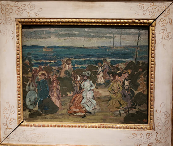
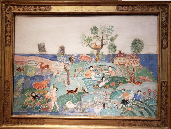
The brothers clearly had a strong working relationship, and both artists’ works are worthy of admiration. My favorites were “Bathers at Passamaquoddy Bay” by Maurice, across the room from Charles’s “Fairy Story.” Around his brother’s painting, Charles has crafted a tasteful monochrome gold frame. The frame’s texture wakes the sandy browns of the sea rocks and also sharpens the space between the brush strokes. There is an openness here, made airier when squared by smooth wood. Similarly, in his own scene of frolicking, Charles paints a clear sky and tilted horizon, his floral-themed gold frame adding a breath of whimsy.
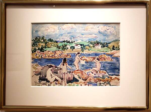
The comparison between these two artists has a lasting effect. I can better understand the continuum of artistic styles, as well as the contrasting effects of varied mediums such as oil versus watercolor, gesso, and tempura; canvas, wood, glass. Often my museum experience brings me to artists who have completely abandoned the frame—whether it’s painters whose raw canvas stands on its own or sculptures and installations where the boundaries are figurative. The Prendergast brothers’ work shows that these boundaries need not divide the art world, nor do we need to group artists together out of convenience or disregard one element in favor of another. Thanks to Maurice and Charles Prendergast, I can better see the whole.
For more information about Maurice and Charles Prendergast, look to the Williams College Museum of Art and the Prendergast Archive and Study Center.
The New Britain Museum of American Art was the first in the nation to focus exclusively on American art.
Amy Nawrocki is the author of five poetry collections, most recently Reconnaissance, published by Homebound Publications. Her work has appeared in such venues as The Connecticut River Review, New Millennium Writings, Phi Kappa Phi Forum, Sixfold, The Poet’s Billow, and Lay Bare the Canvas: New England Poets on Art. She is also the co-author, with her husband Eric D. Lehman, of three Connecticut history books, including A History of Connecticut Food and Literary Connecticut. Their column “The Ark of Taste” appears in Edible Nutmeg. Amy’s latest book The Comet’s Tail: A Memoir of No Memory is available from Little Bound Books. She is an associate professor of English at the University of Bridgeport and lives in Hamden, Connecticut.