
“I am a realist painter,
but we can never paint exactly what we see …”
Interview with Jennifer Nelson, WTP Feature Writer
 Rebecca Giles is a still life painter who was born in Media, PA, but grew up in Europe and the Middle East. At the age of twelve, Rebecca discovered oil paints when she befriended an Uzbekistani artist living in her neighborhood in Turkey and began working next to him in his studio. Rebecca, eighteen, is a second-year student at the Pennsylvania Academy of the Fine Arts (PAFA) in Philadelphia.
Nelson: You are remarkably accomplished for an artist so young. How old were you when you first began painting, and how did your artist friend from Uzbekistan influence your decision to become an artist? What did you learn from him?
Giles: I’ve always painted, but never had the opportunity to take art lessons until I met Obeydollah Tajiev, my artist mentor. Once I met him, I started taking my artwork very seriously. He began giving me informal art lessons in exchange for English lessons from my dad and asked my parents to take me over to his studio as often as possible. When I was twelve years old, he began asking me to paint some of his commissioned portraits and splitting the profits with me. I began to view myself as a professional artist and to seek out commissions of my own. It seemed natural that this would continue to be my career path for the rest of my life. In learning from a professional artist rather than having art lessons in school, I was extremely fortunate to be introduced to the business aspect of being an artist as soon as I was introduced to the creative aspect; these two were never separate in my mind as a teenager.
Nelson: Now that you are in your second year at the Pennsylvania Academy, how have you already seen your work progress since then?
Giles: My work has progressed tremendously since I began at PAFA. During high school, I was a painfully slow painter. I wanted to work faster but never could. My training at PAFA has improved my ability to accurately represent what I see and has increased my familiarity with my materials and how they will work; this has given me the ability to paint quickly and confidently.
Nelson: Your work, which appears in WTP Vol. VI #10, is noteworthy for its vibrant, at times neon, colors—while this could prove a difficult palette to work with, you return to it time and again, and to dynamic effects, contrasted sharply against dark backgrounds. How did you come to work with such high intensity of color?
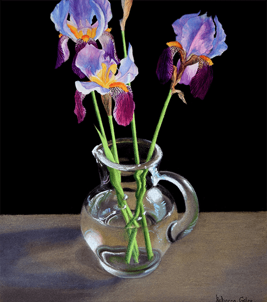
Giles: Because I am autistic, I experience some sensory sensitivities; lights often cause a strong reaction in me, hitting me with stunning force and making me shiver, become weak, or feel dizzy. I find light fascinating. As I paint my still lifes, I focus on the way that the objects are lit and try to recreate the way that the light makes me feel. To do this, I must intensify or exaggerate the colors in my paintings because I find that visual accuracy doesn’t always translate into an accuracy of sensation. I use dark backgrounds to focus attention on the vibrant color and light.
Nelson: There is an element of realism to most of your works; an acute attention to detail. On the other hand, there is an element of the hyperreal, which could be attributed to their vibrancy. As an artist, how important is it to you, the representational—depicting what is real–or not? Is there a balance you are striving for?
Giles: I am a realist painter, but we can never paint exactly what we see because our vision must be filtered through our mind before we can transfer it to canvas. Our mind takes away the objectivity of our vision by focusing more on some things than on others. Furthermore, painting is an act of memory; I first look at the object that I want to paint, then my mind holds my experience of it as a memory while I turn away for a moment to look at the canvas. Since my paintings come from my mind’s filtered remembrance of my experiences, they may have an element of the hyperreal. However, they must always have an element of realism because nonrepresentational work would not be true to my experiences, since I have experienced looking at real objects.
Nelson: In “Warm Light, Cool Light,” you use pastel and watercolors on paper, which, compared to your oils, manifests in a more muted effect—an effect quite the opposite of your vibrant oils, but nonetheless resonate. When choosing your subjects, how do you make these choices between mediums and the effect you are trying to achieve?
Giles: While I often look for an intense, powerful, vibrant image, sometimes I want to portray a softer kind of light. In “Warm Light, Cool Light,” I used watercolors for areas that were more brightly colored and chalk pastels for more muted areas. When working on paper, pastel is my medium of choice when I want a more muted effect because of its opacity; it doesn’t allow for the transparency that creates vibrancy. For a more vibrant effect, I apply watercolors in thin transparent layers of unmixed color. When light hits the painting, it reflects off the white paper beneath the transparent watercolor, creating a shimmering brightness, but that can’t happen when I cover the white paper in opaque pastel.
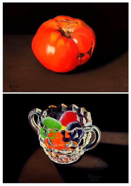
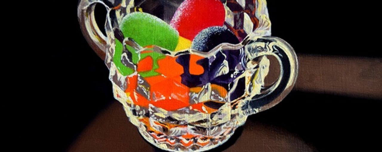
B: Rebecca Giles, Gumdrops in a Sugar Bowl
Nelson: What are the challenges and benefits of working on small-sized paintings, such as “Gumdrops in a Sugar Bowl’ and “Heirloom Tomato,” which are only 5”x7”?
Giles: Small paintings are close and intimate and have a compelling simplicity and peace. A painting of a single object is an opportunity for careful observation with no surrounding distractions. Small things have a certain preciousness. Larger paintings have a different set of advantages; they can immerse the viewer more fully within the experience, they can surround and overwhelm with color. To choose the size of a painting, I must ask myself what effect I want to create.
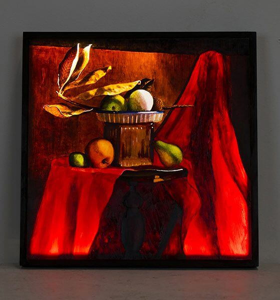
Nelson: In “Crimson Glow”—a still life of fruit and leaves—colors become vibrant and brushstrokes are visible. Can you talk about your process for this work, which included constructing a light box with LEDs inside and painting on a Plexiglas panel?
Giles: The idea of incorporating physical light into a painting stemmed from my frustration with the limitations of paint. Oils and canvas do not allow me to perfectly recreate the sensory experience of light because they do not have light’s intensity or the physical properties. To create a painting surface that would emit light, I wrapped three rows of tiny LEDS around the inside of a shadowbox, which was painted white to reflect the light. I attached a frosted Plexiglas panel to the front, sanding it to give the surface some texture. I then painted on the Plexiglas with oils, building up the colors slowly in thin transparent layers.
Nelson: You have your whole life ahead of you. How do you see your art evolving in the future?
Giles: I will always remain a still-life painter and will always continue my exploration of light; however, my work is evolving and growing. As I move forward, I would like to experiment with different ways of using artificial light and other technology in my paintings. I will improve the design and presentation of my lightboxes and will build much larger ones. I am also thinking about how I could begin to incorporate printmaking into my paintings. Monotype printmaking, in which I paint with oils on Plexiglas printing plates, is a process that appeals greatly to me. The resulting prints have a unique translucent quality that creates a sense of light and reminds me of paintings on Plexiglas lightboxes.
Copyright 2018 Woven Tale Press LLC. All Rights Reserved