
Fall 2018 Highlights
By Emilia Dubicki, WTP Art Correspondent
Four times a year, WTP art correspondents from around the country will report back on the previous season, with images from exhibitions you otherwise might have missed, and their own insights into these varied venues.
The fall art season in New York overflows with exhibits and I saw a lot of artwork, and what emerged time and again was a visual dialogue between these various artists and their paintings. Reoccurring styles of abstraction, expressionist and geometric, wove themselves through the art, as did similar color schemes in works both spontaneous and calculated.
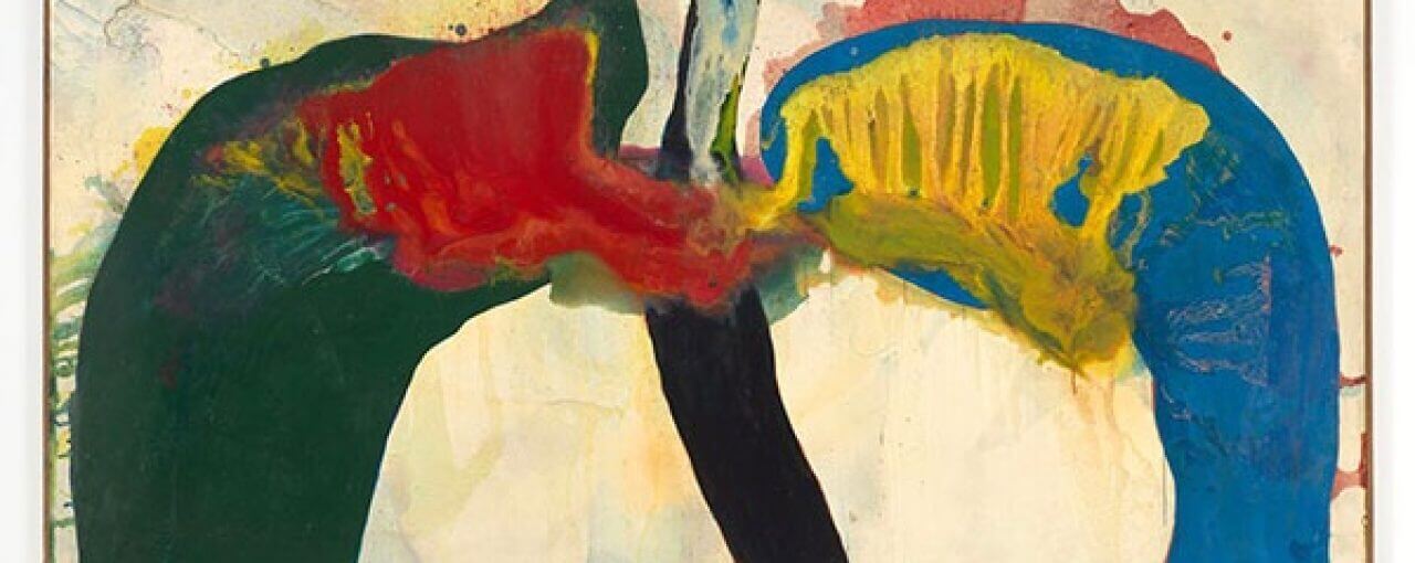
Contemporary painter Elizabeth Neel’s exhibit Tangled on the Serpent Chair at the Mary Boone Gallery’s Chelsea location was a knock out, with large abstract paintings luring viewers into their open expanses. The paintings are sometimes airy, sometimes layered with paint—thicker in some areas, washes in others—with shapes poured, wiped, rolled, or brushed. Neel also folds painted canvases to create asymmetrical, Rorschach-like forms, and it is the center created within the unfolded work where the viewer enters the paintings. The paint saturates the canvases and the spread of insect or avian wings emerges as a backdrop for other shapes. In some works, flat geometric bars of white-and-black paint hover in the foreground, creating a spatial depth while setting up an architectural form beyond which an abstract world exists. Organic and biomorphic forms are contrasted against more rigid structures of geometric shapes.
Neel’s abstract world references nature with its earth-tone colors of greens, blues, browns, and grays. Painting titles include “Avian Clench,” “Widen their Jaws,” “April Clearly.” Other paintings reference literary works, objects, or historical forms of representation. “Tongues Lolling,” the largest painting at 78” x 188”, is a subtle, teasing celebration, with dripping clouds of pinks against splashes of green. If a painting can be described as breathy, this one is just that.
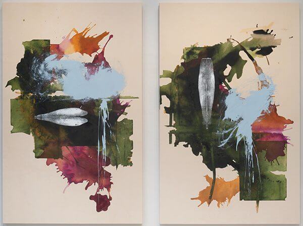
“Island People”, the show’s only diptych, looks to be a landscape in greens and rusty oranges, plum, and splotches of sky blue. Each canvas has in it an asymmetrical form, one horizontal, the other vertical, each, I imagine, to be the island travelers. And that each is on a separate canvas only adds to the story being told, a story for viewers to complete. It is, too, the empty space around the central painted activity in Neel’s works that allows one to concentrate on the action that has literally unfolded in this work. The areas of blank canvas allow the viewer to focus on all the movement and also on areas of geometric stillness in the paintings. From the artist’s perspective, there may be a very different narrative happening in each of the show’s paintings, but visually the works talk to one another seamlessly.
The light grounds of Joan Mitchell’s paintings are as much a part of each work as are the textured oils, the drips, and the smudges. These white and natural areas give the colors’ exuberance an atmosphere in which to be passionate. In Joan Mitchell: Paintings from the Middle of the Last Century, 1953–1962 at Cheim & Read, it’s clear that Mitchell knew very well how to compose her paintings—she orchestrated her pieces with energy, mood, and emotion, via collisions of color that ultimately were harmonic, resulting in intense visual symphonies.
In the earliest work, “Untitled” from 1953–54, painted when Mitchell was twenty-eight years old, muted earth tones quietly reveal themselves and disappear into off whites, hinting at a landscape. “Liens Colores,” circa 1956, is also muted, but with a bit more color—blue-greens, reds—surfacing and swirling around an off-center tangle of painted activity. These two paintings are in a gallery room of their own, the first on your entrance to Cheim & Read. They are a prelude to the paintings that follow in the adjoining larger gallery, where color and bigger, bolder expressions of paint prevail.
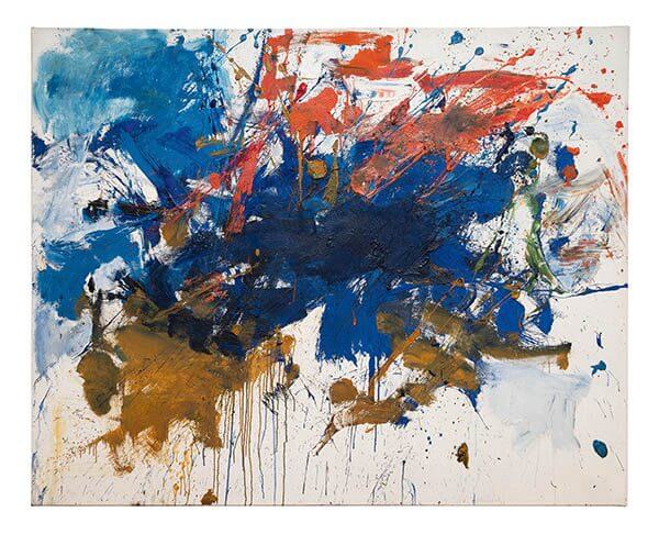
I see the landscape in greens, ochres, deep reds in the stacked horizontal swipes of color organizing the drips and marks in the paintings from 1958 and 1959. The paintings from 1960/61 have bigger expanses of blues, pinkish orangey red, burnt umber, and ochre. The “Untitled (Blue Michigan)” references Mitchell’s childhood in Chicago, the paint seemingly rushing together like an intense whoosh of water. The rhythm of water is felt throughout many of the show’s paintings.
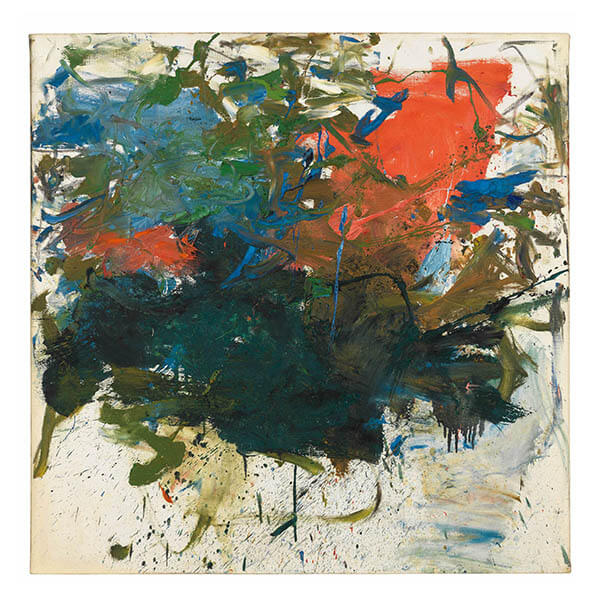
“Garden Party” is just that, with greens, burnt red, ochres, colliding and dripping onto the open spaces of the canvas. A hint of grayish-blue sky peeks through. You feel the weather in Mitchell’s paintings, through her smudges, stains, and impasto, from brushes loaded with browns, grays, blacks, and dark greens that reference natural environments.
Still in Chelsea, I went to see Crescendo at the Marianne Boesky Gallery, a new body of abstract paintings by Svenja Deininger (on view through December 22). My habit is to look first, read wall text later. I didn’t pay much attention to the show being titled Crescendo. What I did quickly sense was the beautiful depth and richness of Deininger’s intense reds, blues, flesh tones, as well as of her black and whites. In many of the works are vibrant crisp lines, bands, and geometric shapes. In others, figurative forms in dusty, fleshy pink mauves, or combined geometry and figuration, even with band-aid like shapes.
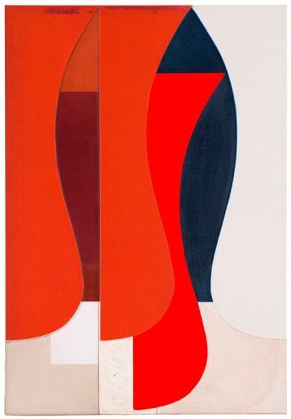
My eyes moved expectantly from one painting to the next, dazzled by patterns, colors, and shapes repeating and transforming. Deininger’s paintings of various styles and sizes—the intimate to expansive—create a complex narrative, at times visually louder, then transitioning to softer moments, bold to sultry and subtle, returning to bursts of red, mustard, and cerulean. Straight vertical lines create order and delineation while curves lead to the next painting. Deininger intentionally builds the show’s works to a crescendo, but still each painting hangs confidently on its own. The artist works her surfaces smooth and the oils penetrate deep into the life of the paintings. At the same time, shapes and lines appear to move and float.
There is vertical and horizontal imagery, buildings and bodies, with one representational outline of a female hip area, in clean curves of pink outlined in blue and black. This painting hangs solo in a passage leading from the front of the gallery—someone moving through a landscape, on a journey? Deininger began this body of work in Milan and completed it in Vienna, where she lives. Both locations inspired the color palette and silhouettes that lend this show an appealing perfection.
With the above three painters in mind, it was interesting to see even more examples of abstraction at Hauser & Wirth’s uptown Gutai group show. This informative exhibit features notable works from the Japanese collective’s core artists, including Tsuyoshi Maekawa, Takesada Matsutani, Sadamasa Motonaga, Shozo Shimamoto, Kazuo Shiraga, Atsuko Tanaka, Chiyu Uemae, Tsuruko Yamazaki, and Jiro Yoshihara, who formed the collective in 1954. Its dissolution came in 1972. Yoshihara’s definition of Gutai was embodiment and concreteness.
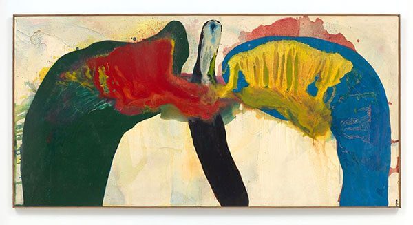
Sadamasa Motonaga’s 1964 “Work 145,” a large horizontal abstract, greets you as you enter the gallery. Green, blue, red, yellow, black, and white spread across the surface like a pair of wings, lungs, or some other organic form. The artist applied a second layer of paint to a still wet first layer, a technique known as tarashikomi. The bold colors of the forefront come to life, bleeding and running against the underlying washes of paint. I thought of Elizabeth Neel’s work with its Rorschach-like forms and layers of paint in varying viscosities.
In 1956, Atsuko Tanaka presented her Electric Dress (not in this exhibition). The dress was made of flashing incandescent bulbs painted in bright colors with a control console and inspired by Japan’s neon environments. Tanaka’s paintings in this show reference bulbs, wiring, and geometric patterns.
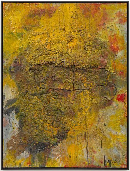
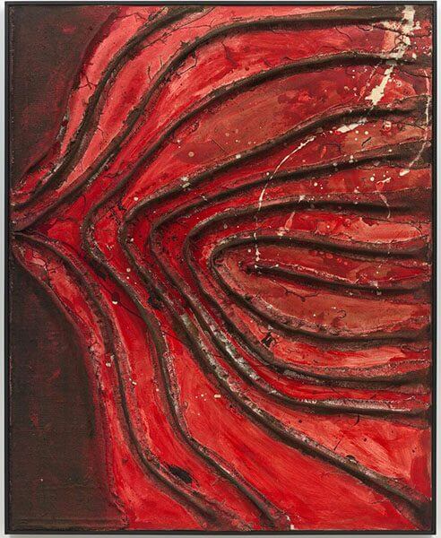
Two paintings by Shozo Shimamoto, a founding member of Gutai, get a gallery room to themselves. The mood is chapel-like, with low lighting, and the works, one in reds, the other in mustardy yellows, command reverence, as if from an archeological excavation, with their gnarly surfaces of paint, mixed media, and paper.
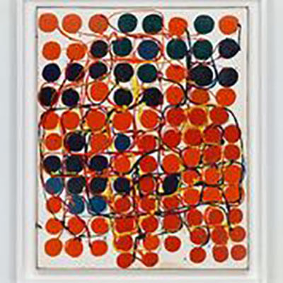
Five paintings by Kazuo Shiraga feature the artist’s dynamic, expressionist, thick swirls of paint that he manipulated with his feet, while suspended from ropes, the act of painting becoming an energetic performance. Tsuyoshi Maekawa’s sculptural, organic paintings of formed burlap under red, black, and ochre paint exemplify yet another completely different painting style among the Gutai artists. Chiyu Uemae’s 1963 red, white, and black painting composed of built-up oil paint and paint-tube caps embedded in the work’s surface, is repetitive and pattern oriented—yet another style of expression within the movement.
Up until December 22 at Hauser & Wirth’s 69th street location, there is much to consider and marvel at in this show, with twenty-eight works on three gallery floors. The final line of the Gutai Art Manifesto, published in 1956 and written by Yoshihara Jiro, appropriately describes the various works of this exhibit: “Gutai aspires to present exhibitions filled with vibrant spirit, exhibitions in which an intense cry accompanies the discovery of the new life of matter.” This description also easily apples to the art of Neel, Mitchell, and Deininger.
If you are interested in becoming an art correspondent for WTP, please inquire at wtp@thewoventalepress.net
Copyright 2018 Woven Tale Press LLC. All Rights Reserved.